Four Colours Are Enough If They Are Zorn's Four
A restricted palette built from two earth tones, a red, and white has become one of the most taught systems in figure painting — even though its namesake may not have applied it as rigidly as the legend suggests.
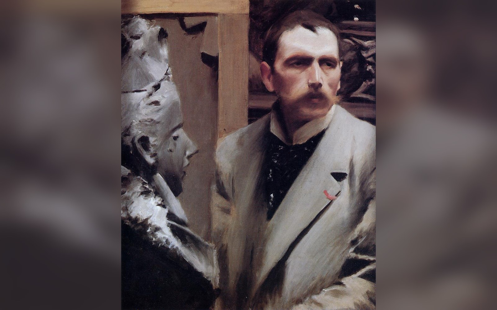
Zorn’s own tonal modelling, which is where the four-colour legend was reverse-engineered from.
Photo: Self Portrait by Anders Zorn · Wikimedia CommonsThe Four and What They Do
The palette named for Swedish painter Anders Zorn — ivory black, yellow ochre, a warm red (traditionally vermilion, now more often cadmium red), and lead white — works because of what ivory black actually is. Ivory black is a soft, slightly warm black that mixes with white into cool, bluish greys, which means the four pigments together span a surprisingly complete value and temperature range for human skin. Mixed warm with ochre and red, they produce ruddy highlights and mid-tones; pushed toward black and white, they yield the cool blue-grey of a shadow without a separate blue pigment anywhere on the palette.
The range is not an accident. A warm red, a middle-value yellow, a near-black with a cool cast, and an opaque white produce chromatic variety through temperature contrast rather than hue variety. Practitioners who use the system — and contemporary atelier programmes have made it close to standard — often cite this constraint as a discipline: decisions about temperature force attention to observed light rather than local colour.
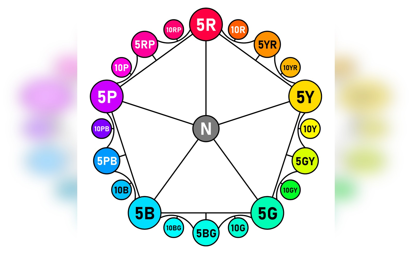
Munsell’s notation laid out as hue circles — the object painters were asked to read flesh against. — Munsell Gave Flesh a Number, and Some Painters Found That Useful.
Photo: Twenty hues of the Munsell color system at maximum chroma · Wikimedia CommonsWhat Zorn Actually Used
Unprimed linen, still sold by the metre off the same Belgian looms.
Photo: cottonbro studio / PexelsThe historical record complicates the legend. Analysis of Zorn's own canvases has revealed traces of pigments outside the canonical four — cobalt blue among them — suggesting that the palette is at least partly a retrospective construction, a pattern extracted from his most tonally unified work and applied as a general rule. Zorn was painting in a tradition of controlled tonal modelling that descends from Rembrandt and runs through the Swedish and American academic mainstream of the late nineteenth century; his palette reflected that lineage rather than a private formula. The Nationalmuseum in Stockholm, which holds significant holdings of his work, offers a more nuanced picture than the four-colour myth.
Where It Stops Working
The Zorn palette handles northern European and light-olive skin under studio or warm outdoor light with real efficiency. It struggles elsewhere. Deep or very cool complexions, greenish shadows, the specific temperature of daylit skin in reflected open sky — all press against the system's limits. Absent a blue, the painter working from observation can compensate only so far through value and mixture. Some practitioners add a blue (often cobalt or ultramarine) as a fifth colour and retain the rest; purists argue this defeats the discipline the palette imposes. Whether the four colours are enough depends, in the end, on what is sitting in the light.